
www.templatemonster.com
This style of an interior (and sometines exterior) design is mostly popular in the southern states. It is distinctively known for making a home decorated in a Southwestern style having a casual and warm look. Terra-cotta tile floors, rustic wooden ceiling beams and rough textures are design details that give these homes a uniquely cozy and old-school feel.
This whole thing of assessing the impact of any given color is usually called “color psychology.” But the very effect that the color scheme color has at different stages of either design or anything else is significant: its physical and psychological. Color use is not something that brings definitive equality between “color and our moods,” as is a currently popular expression. The truth is that wherever we are we respond to certain colors in certain ways. So its quite foolish ti overlook the importance of color. Color use is crucial, whether in our homes or in the places where we work.
Start Small
If you’re not quite confident yet about the color you’re choosing try to experiment in a powder room or bathroom, or basically any small hall or area between rooms. Also trying it at an accent wall may be a good idea. If you’re painting on your own, pick an area that’s quick to finish. That way you’ll be able to see your results faster, and be happy with it or change it. Look at the process as a fun experiment.
To make a start, select a favorite color drawn from an artwork, a rug, dishes and an accessory or furniture piece as a main color or accent.
Think About Your Mood
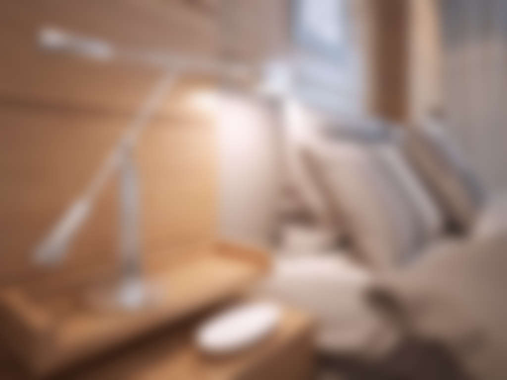
When you’re choosing a color, weigh in on the mood of a room. For example, think of what do you want your bedroom to be like – relaxing or intimate? Each of these 2 sides of mood specter has a color palette representatives of their own. Soft, cool colors and neutrals usually create a smoother feeling while stronger colors are for creating drama.
Do you want your kitchen and dining area to feel sociable and stimulating or be formal and quiet? Warmer, contrasting and bolder colors add to a sociable atmosphere; darker blue-greens and neutrals will give a more formal feel.
Also think, that what you want your kid’s rooms to be needs to go with certain colors too. In order to create an active and exciting energy or a strict and restful feeling see the color palette below. Be careful not to hyper-activate your children with hues that are too bright or intense. You may not know it, but some brighter colors can cause unrest and irritability.
Pay Attention to Lighting
Did you ever wonder why do the paint stores have light boxes for you to test paint chips? In fact, there a lot of just reasons, that highlight how the lighting and the color scheme go together and influence one another:
Natural daylight shows the color in its original quality;
Bright lighting brings out warmer tones and more shades of yellow;
Fluorescent lighting casts a more blue-ish tone.
All this means is that a strong color might be too bright and overpowering when used on all walls or next to a set of windows. So it might be effective to use such color schemes as an accent wall, which is not exposed to a direct sunlight all the time.
Learn the Color Terms
On top of that, this whole “color scheme” science actually have an expanded terminology of its own!
Hue is what we call a color. Red is the hue; blue is the hue.
The value of the hue depends on how light or dark it looks to be.
Saturation means just how dominant the hue is. As we go from red to pink, the red hue starts to appear less dominant.
Intensity is the brightness of the color. The pure colors such as red are more intense than the combined colors such as yellow-green. A color that’s more intense usually has a more dominant hue.
If you want a more active space, consider using stronger, more intense hues. Even in case you want a light-colored room, pick colors that are slightly more saturated than off-white or the light ones. Overly-light colors can feel too bright and stark when it appears on all surfaces in a room. However, two or more medium-light, similarly pastel colors can create a better luminous effect when used in the same room.
Test Your Color Choice
Confirm your choice of a color by testing how do they look when painted on a poster board or large areas of a wall. Don’t be afraid to get out of your visual comfort zone. When doing this whole testing, we’d recommend you try strong, vivid colors or soft, deep neutrals like chocolate brown or olive green as main or accent colors. As a counter-option, you can go for a more dramatic effect with a stronger color on the ceiling.
Tinted ceilings can seriously change the whole look of a room.